[custom_adv]

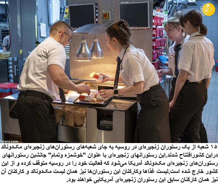
The McDonald’s logo had to be taken down. What took its place were two slanted yellow lines and a red dot, forming an “M” shape, within a green circle. As the Deseret News previously reported, this new trademark is meant to indicate a burger and fries within a green color that signifies “the quality of products and services.”
